iPhone 18 Pro: Unveiling the Palette of Power - Dark Cherry, Light Blue, and Dark Gray Emerge
Anticipation builds as new reports suggest a significant color refresh for the upcoming iPhone 18 Pro series. Macworld's sources indicate the departure of Cosmic Orange, making way for sophisticated Dark Cherry, serene Light Blue, and classic Dark Gray. This strategic shift reflects Apple's evolving design philosophy and market insights, promising a fresh aesthetic for its premium devices.
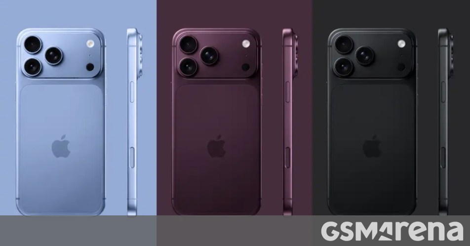
The world of consumer technology is abuzz with the latest whispers from Cupertino, specifically concerning the aesthetic direction of Apple's highly anticipated iPhone 18 Pro series. For years, the launch of a new iPhone has been more than just a technological unveiling; it's a cultural event, a design statement, and a predictor of future trends. This year, the spotlight is firmly on color, with a new report from Macworld claiming to have "cracked the code" on the palette that will adorn the next generation of Apple's flagship smartphones. According to "sources familiar with Apple’s supply chain," the iPhone 18 Pro and 18 Pro Max are set to introduce a refreshed spectrum, bidding farewell to the vibrant Cosmic Orange and welcoming the sophisticated hues of Dark Cherry, Light Blue, and Dark Gray.
The Evolution of iPhone Aesthetics: A Historical Perspective
Apple's approach to color has always been a delicate balance between innovation and timeless elegance. From the monochromatic beginnings of the original iPhone to the vibrant array of the iPhone 5c and the sophisticated finishes of recent Pro models, each color choice tells a story about the company's design philosophy and its understanding of consumer preferences. Early iPhones were largely confined to black and white, emphasizing the revolutionary technology within. The introduction of gold, rose gold, and later, Pacific Blue and Sierra Blue, marked a strategic shift towards offering more personalized and premium options. These colors often reflect broader fashion and design trends, acting as subtle indicators of the zeitgeist. The departure of Cosmic Orange, a color that made a bold statement, suggests Apple is perhaps moving towards a more universally appealing, yet still distinctive, range for its Pro line. This isn't merely about aesthetics; it's a carefully calculated decision influenced by market research, manufacturing capabilities, and brand identity.
Decoding the New Color Choices: Dark Cherry, Light Blue, and Dark Gray
Let's delve into the potential implications and appeal of these rumored new shades. Dark Cherry evokes a sense of deep luxury and understated power. It's a color often associated with high-end automobiles, fine wines, and classic elegance. For the iPhone Pro series, which targets users who value premium design and cutting-edge performance, Dark Cherry could be a perfect fit, offering a rich, mature alternative to the more conventional blacks and silvers. It suggests sophistication without being ostentatious, appealing to a demographic that appreciates subtle refinement.
Light Blue, on the other hand, brings a breath of fresh air. It's a color often linked to tranquility, clarity, and innovation. After several generations featuring deeper blues like Pacific and Sierra Blue, a lighter shade could offer a softer, more contemporary feel. This could resonate with users looking for a device that feels modern and approachable, yet still premium. It might also reflect a broader trend towards lighter, more ethereal color palettes seen across various design sectors, from interiors to fashion. The challenge for Apple will be to ensure this Light Blue maintains the 'Pro' aesthetic, perhaps through a matte finish or a specific metallic sheen.
Finally, Dark Gray is a return to a classic, but with a potential twist. While space gray has been a staple, a distinct 'Dark Gray' could imply a deeper, perhaps more textured or nuanced shade than previous iterations. This color choice speaks to timelessness, professionalism, and versatility. It's a safe yet elegant option that will undoubtedly appeal to a broad segment of the market, especially those who prefer a more subdued and business-appropriate device. Its inclusion suggests Apple is ensuring a foundational, highly marketable option remains, even as they experiment with more distinctive hues.
Strategic Implications for Apple and the Market
The introduction of new colors is far from a trivial matter for a company like Apple. It's a critical component of their product strategy, designed to stimulate demand, differentiate new models from previous generations, and cater to evolving consumer tastes. Each color launch is backed by extensive market research, analyzing trends, competitor offerings, and internal sales data. A successful color palette can significantly boost initial sales, create buzz, and even influence upgrade cycles. For instance, the popularity of certain colors in past models has often led to their retention or adaptation in subsequent releases.
Moreover, these color choices can influence the accessory market, from cases to watch bands, creating a ripple effect across Apple's vast ecosystem. The shift away from Cosmic Orange, if true, indicates that while bold experiments are part of Apple's strategy, they are also quick to adapt based on market reception and the desire to maintain a cohesive brand image. This year's rumored palette suggests a move towards a more refined, perhaps slightly more conservative, yet still distinct, aesthetic for the Pro line, aiming for broad appeal while retaining a sense of premium exclusivity.
The Future is Bright (and Dark Cherry): What to Expect
As we inch closer to the official unveiling of the iPhone 18 Pro series, the anticipation around these rumored colors will only intensify. While these reports remain speculative until Apple's official announcement, the consistency of information from supply chain sources often proves reliable. The potential introduction of Dark Cherry, Light Blue, and Dark Gray signals a thoughtful evolution in Apple's design language, aiming to refresh the Pro line's appeal while maintaining its premium stature. These colors are more than just cosmetic changes; they are carefully chosen elements that contribute to the overall user experience and the iPhone's enduring legacy as a design icon. Consumers can look forward to a blend of classic elegance and modern sophistication, ensuring the iPhone 18 Pro series not only performs exceptionally but also looks the part. The future of iPhone aesthetics appears to be a nuanced blend of depth, serenity, and timeless appeal, promising a compelling choice for every discerning user.
Stay Informed
Get the world's most important stories delivered to your inbox.
No spam, unsubscribe anytime.
Comments
No comments yet. Be the first to share your thoughts!