iPhone 18 Pro's 'Titanium Ember': A Deep Dive into Apple's Next Iconic Hue
Apple is poised to redefine smartphone aesthetics with the iPhone 18 Pro's rumored 'Titanium Ember' hero color. This unique reddish-brown hue, inspired by molten metal, signals a bold departure from previous designs. Our exclusive analysis explores the design philosophy, market impact, and technological implications of this highly anticipated color, setting a new standard for premium device finishes.
In the ever-evolving tapestry of smartphone design, Apple has consistently set benchmarks, not just in technology but also in aesthetics. Each new iPhone generation brings with it a carefully curated palette, often highlighted by a singular ‘hero’ color designed to capture the public imagination. For the upcoming iPhone 18 Pro and iPhone 18 Pro Max, whispers from Cupertino suggest a hue so distinct, so unprecedented, that it promises to redefine what we expect from a premium device finish: 'Titanium Ember.'
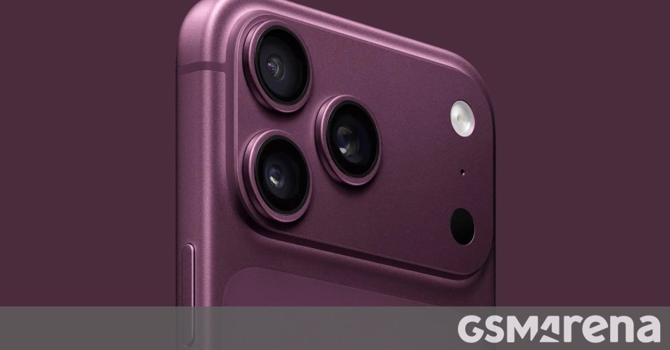
This isn't merely another shade of red or brown; sources indicate 'Titanium Ember' is a complex, reddish-brown tone with metallic undertones, reminiscent of molten titanium or the glowing embers of a forge. It’s a sophisticated, almost industrial-organic blend that stands in stark contrast to the brighter, more vibrant hero colors of previous iterations, such as the 'Cosmic Orange' of the iPhone 17 Pro. This strategic choice by Apple signals a deeper design philosophy, one that seeks to marry raw elemental power with refined technological elegance.
The Art of the Hero Color: Apple's Design Philosophy
Apple's approach to color is never arbitrary. Each hero color is meticulously chosen, reflecting broader design trends, technological advancements, and even subtle shifts in consumer psychology. Historically, these colors serve multiple purposes:
* Brand Differentiation: A unique color instantly distinguishes the new model from its predecessors and competitors. * Marketing Focus: It becomes the visual centerpiece of advertising campaigns, embodying the device's essence. * Perceived Value: Premium, well-executed colors enhance the perception of luxury and exclusivity. * Emotional Connection: Colors evoke feelings and associations, influencing purchasing decisions.
The transition from the vibrant 'Cosmic Orange' to the more subdued yet powerful 'Titanium Ember' suggests a maturation in Apple's design language for its Pro line. While 'Cosmic Orange' exuded energy and playfulness, 'Titanium Ember' hints at resilience, sophistication, and understated power. It speaks to a user who values depth and subtlety over overt flashiness, aligning with the Pro moniker's emphasis on professional-grade capabilities and refined aesthetics. This shift could also reflect a broader industry trend towards more earthy, natural, and metallic tones, moving away from saturated primary or secondary colors.
Unpacking 'Titanium Ember': A Technical and Aesthetic Marvel
Creating a color like 'Titanium Ember' is no small feat. It involves complex material science and manufacturing processes. Given the name, it's highly probable that the finish will leverage the titanium frame introduced in previous Pro models, allowing for a unique anodization or PVD (Physical Vapor Deposition) process that infuses the metal with this specific reddish-brown hue. This isn't just a paint job; it's an integration of color into the material itself, promising durability and a premium tactile experience.
* Material Integration: The color is likely not a superficial coating but deeply embedded into the titanium, offering scratch resistance and color longevity. * Light Interaction: The metallic properties of titanium, combined with the 'ember' tones, suggest a finish that will interact dynamically with light, shifting in appearance depending on the viewing angle and ambient conditions. This creates a sense of depth and luxury that flat colors cannot achieve. * Ergonomic Appeal: Beyond visual appeal, the finish contributes to the overall ergonomic experience. A well-executed metallic finish feels substantial and premium in hand.
The choice of 'Ember' in the name is particularly evocative. Embers are the glowing remnants of a fire, symbolizing enduring warmth, hidden power, and transformation. This metaphor perfectly encapsulates the blend of natural elements with cutting-edge technology that Apple often strives for. It's a color that feels both ancient and futuristic simultaneously.
Market Impact and Competitive Landscape
Apple's color choices often ripple through the entire smartphone industry. When a new hero color is introduced, competitors frequently follow suit, attempting to replicate its success or offer their own interpretations. The introduction of 'Titanium Ember' could spark a new wave of earthy, metallic, and complex brown/red tones across various brands.
From a market perspective, this color could appeal to a broader demographic than some of Apple's more vibrant past choices. Its sophistication makes it suitable for professional environments, while its unique character ensures it stands out. It's a color that suggests discretionary spending and a discerning taste, aligning perfectly with the premium positioning of the Pro models.
Furthermore, the success of a hero color can significantly impact sales. A visually striking and unique option often drives initial adoption, especially among early adopters and fashion-conscious consumers. Analysts will be closely watching how 'Titanium Ember' resonates with the market, potentially influencing Apple's future color strategies.
The Future of iPhone Aesthetics: Beyond 'Titanium Ember'
The 'Titanium Ember' leak isn't just about a single color; it's a window into Apple's evolving vision for the iPhone. It suggests a move towards more organic, textural, and perhaps even environmentally conscious design choices. As technology becomes increasingly integrated into our lives, the desire for devices that feel less like cold machines and more like natural extensions of ourselves grows.
This direction could pave the way for future iPhones to explore a wider range of natural material-inspired finishes, perhaps incorporating more recycled materials with visible textures or developing colors that mimic geological formations or natural phenomena. The emphasis on the titanium frame as a canvas for color also highlights Apple's commitment to using advanced materials not just for durability but also for aesthetic innovation.
In conclusion, 'Titanium Ember' is more than just a new shade for the iPhone 18 Pro. It represents a bold statement from Apple, a commitment to pushing the boundaries of smartphone aesthetics with a color that is both deeply rooted in natural inspiration and meticulously engineered for the modern age. As the launch approaches, the anticipation for this unique hue will undoubtedly build, solidifying its place as a potential icon in the pantheon of iPhone colors and setting a new benchmark for the industry.
Stay Informed
Get the world's most important stories delivered to your inbox.
No spam, unsubscribe anytime.
Comments
No comments yet. Be the first to share your thoughts!